Hi, I'm Sean.
Co-founder & CTO at B3, building a crypto agent & decentralized inference. Previously Coinbase. I sweat the small details in software, and leave the good parts (components, free tools & writeups) out in the open here.
Components
all →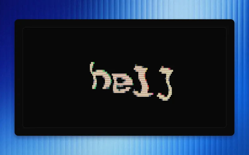
ASCII Text
3D text rendered to a wavy three.js plane, then re-sampled every frame into live ASCII characters that shimmer and follow your cursor. From B3's ai-arena.
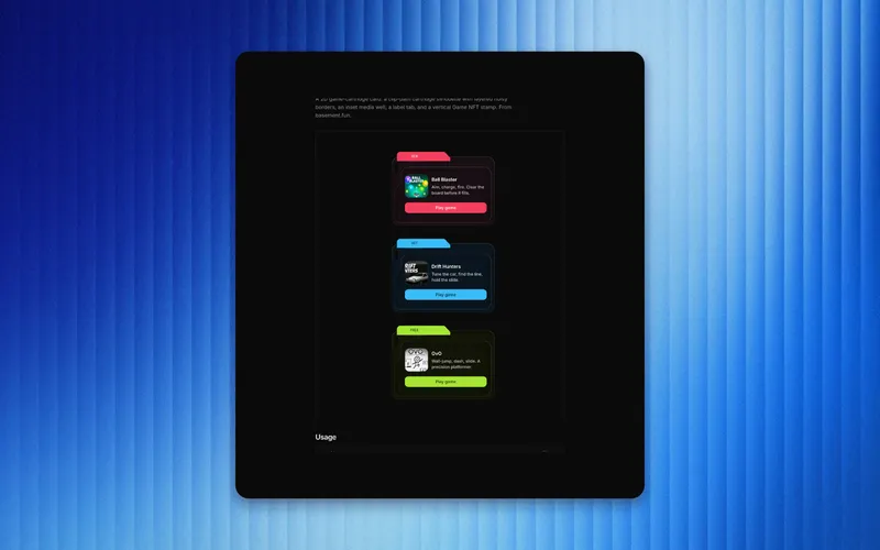
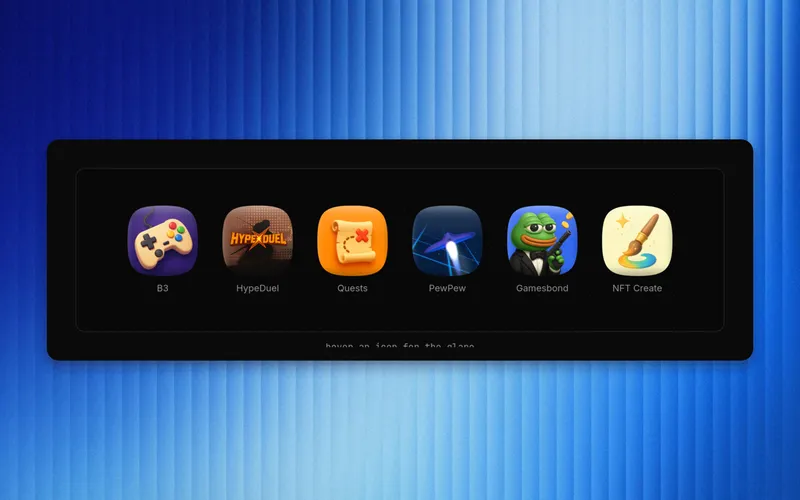
Compact Cartridge
A 2D game-cartridge card: a clip-path cartridge silhouette with layered noisy borders, an inset media well, a label tab, and a vertical Game NFT stamp. From basement.fun.

Loading Beam
A laser-beam loading bar: a fill that races to 100% on an eased, jittery curve with a flickering glow and a blurred light at the leading edge. Pure CSS. From basement.fun.
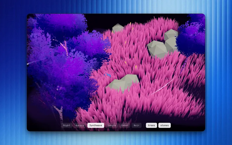
Infinite Terrain
An endless procedural WebGL scene — streamed grass, trees, and wind lines with a physics ball you steer — that you can reskin live across six moods: night, aurora, synthwave, sakura, ember, noir. Restyled from mesq's MIT r3f original.
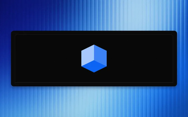
Isometric Cube
An isometric 3D cube in pure CSS transforms — three faces tinted from one base color (lighter top, base front, darker right), optional logo on top, optional slow spin. Extracted from explorer.b3.fun.
App Icon
A glossy iOS-style squircle app icon: SVG squircle clip, a top sheen, an inset rim, and a glare that sweeps on hover. Extracted from explorer.b3.fun.
Writing
all →
Cross-chain intents: you sign what you want, a solver eats the risk
ERC-7683 replaced 'operate a bridge' with 'sign a wish' by letting a solver front you the destination-chain funds and get reimbursed on origin later. The risk didn't disappear, it moved to whoever can afford to hold inventory on every chain, and that's the part nobody's explainer thread mentions.

Capability security for agent wallets: least authority for bots
MetaMask shipped an agent wallet that lets bots move money without ever holding the root key, and the trick underneath it is forty years old and has nothing to do with crypto. This is a walkthrough of session keys, ERC-4337's validation phase, and ERC-7710/7715, grounded in what it actually takes to let a trading agent hold keys in production.

Bonding curves, derived
A token launchpad looks like a casino but it's a calculus exercise. This post derives the buy price on a bonding curve from p(s) up, linear, exponential, and the constant-product curve pump.fun actually ships, and shows why curve shape decides who gets paid for being early.

Are you getting the model you paid for?
You send a prompt to an API labeled GPT-X, you pay GPT-X prices, and you get something. Maybe GPT-X. Maybe a 4-bit quantized stand-in that is 30 percent cheaper to serve and almost indistinguishable. There is no reliable way from the outside to tell, and I will show you the math for why the hardest case needs an infeasible number of samples to catch.

Your Slack status should know what your agents are doing
You kick off a few coding agents, walk away, and your team has no idea whether anything's happening. So I built agentblip: it turns your local Claude Code and Codex sessions into your Slack status, formatted on your own machine. Open source, MIT.

An agent that hallucinates a transaction is an incident
A chatbot that's wrong wastes a sentence. An onchain agent that's wrong moves money you can't claw back. The moment you point a model at a wallet, the interesting part stops being the model. Here's what 'everything around it' actually is.