3D Cartridge
A draggable 3D game cartridge in pure CSS 3D transforms: spin it with a drag or swipe, snap to front/back, with the body color cast from an accent drop-shadow. Extracted from basement.fun.
Mint once, play forever
seangeng.com
drag the cartridge to spin · release to snap front/back
Usage
import { Cartridge3D } from "~/components/cartridge/cartridge-3d";<Cartridge3Dtitle="My Game"mediaUrl="/cover.png"accentColor="#3b82f6"backLabel="seangeng.com"isHovering/>
The shell art lives in /public/cartridge/ (four PNGs + a texture). Grab them from the zip below.
A cube made of faces, colored by a shadow
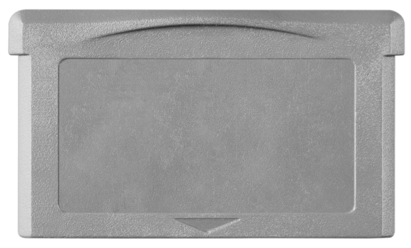
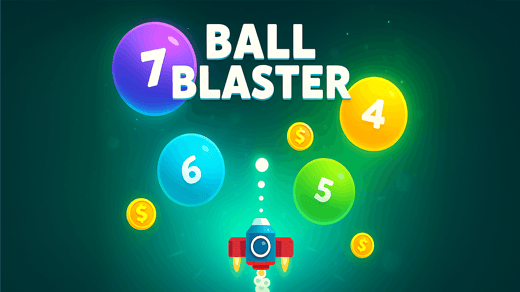
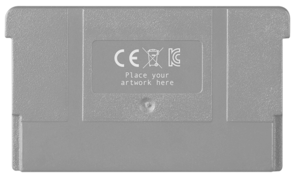
The cartridge is a transform-style: preserve-3d box with six positioned faces: a front and back holding the PNG shell, and thin side/top/bottom faces filled with the accent color to give it depth. Dragging writes a single --rotation variable onto the box; on release it snaps to the nearest 0 or 180 degrees.
My favorite trick is how the body gets its color. The shell PNG is transparent, so instead of tinting it, a copy is given a drop-shadow offset 1000px down in the accent color, and the layer holding it is shifted up 1000px with mix-blend-mode: overlay. The shadow lands exactly over the shell and recolors it, so one PNG works for any accent.
/* The body color is a drop-shadow cast through the transparent PNG */.cartridge-shadow {filter: drop-shadow(0 1000px 0 var(--accent-color));}.cartridge-bg { /* the layer that holds it */mix-blend-mode: overlay;}/* Drag updates one CSS variable; release snaps to 0 / 180 */.box.cartridge-box {transform-style: preserve-3d;transform: translateZ(-50px) rotateY(var(--rotation));}
Props
| prop | type | default | description |
|---|---|---|---|
| mediaUrl | string | — | Cover art on the label. |
| title | string | — | Alt text / label title. |
| accentColor | string | — | Body + side color (any CSS color). |
| cartridgeType | "miniSolid" | "miniTransparent" | "miniSolid" | Shell art. |
| backLabel / backBottomLabel | ReactNode | — | Text on the back face. |
| barcode | string | — | Code128 value (rendered via barcodeapi.org). |
| initialSide | "front" | "back" | "front" | Starting face. |
| isRotating / isHovering | boolean | false | Auto-spin / gentle float. |
From basement.fun, a project I work on at B3.
Source
download .zipThe full implementation, across 2 files. Copy it in or grab the zip. It leans on a cn() class helper and the theme tokens (--primary, --border, …).
import React, { useCallback, useEffect, useMemo, useRef, useState } from "react";import { cn } from "~/lib/utils";const CARTRIDGES = {miniSolid: {front: "/cartridge/cartridge-mini-solid-front.png",back: "/cartridge/cartridge-mini-solid-back.png",},miniTransparent: {front: "/cartridge/cartridge-mini-front.png",back: "/cartridge/cartridge-mini-back.png",},};export interface Cartridge3DProps {/** Cover art shown on the cartridge label. */mediaUrl: string;title: string;/** Body / side color (any CSS color). */accentColor: string;cartridgeType?: keyof typeof CARTRIDGES;backLabel?: React.ReactNode;backBottomLabel?: React.ReactNode;/** Optional Code128 barcode value (rendered via barcodeapi.org). */barcode?: string;initialSide?: "front" | "back";/** Auto-spin 360° forever. */isRotating?: boolean;/** Gentle float. */isHovering?: boolean;className?: string;}const CartridgeFront = React.memo(function CartridgeFront({src,accentColor,mediaUrl,title,}: {src: string;accentColor: string;mediaUrl: string;title: string;}) {return (<div className="box__face box__face--front noSelect"><div className="cartridge"><div className="cartridge-bg"><imgsrc={src}alt=""className="cartridge-shadow"style={{ "--accent-color": accentColor } as React.CSSProperties}/></div><img src={src} alt="cartridge front" className="base-cartridge" /><divclassName={cn("cartridge-label group relative overflow-hidden rounded-lg","before:absolute before:inset-0","before:bg-gradient-to-r before:from-transparent before:via-white/20 before:to-transparent","before:translate-x-[-100%] hover:before:translate-x-[100%]","before:transition-transform before:duration-1000 before:ease-in-out",)}><img src={mediaUrl} className="banner" loading="lazy" alt={title} /><div className="absolute inset-0 rounded-lg border border-white/20" /><span className="overlay" /></div></div></div>);});const CartridgeBack = React.memo(function CartridgeBack({src,accentColor,barcode,backLabel,backBottomLabel,}: {src: string;accentColor: string;barcode?: string;backLabel?: React.ReactNode;backBottomLabel?: React.ReactNode;}) {const [barcodeUrl, setBarcodeUrl] = useState<string | null>(null);useEffect(() => {setBarcodeUrl(barcode ? `https://barcodeapi.org/api/128/${barcode}` : null);}, [barcode]);return (<div className="box__face box__face--back noSelect"><div className="cartridge"><div className="cartridge-bg"><imgsrc={src}alt=""className="cartridge-shadow"style={{ "--accent-color": accentColor } as React.CSSProperties}/></div><img src={src} className="base-cartridge" alt="cartridge back" /><div className="absolute left-0 top-5 flex h-full w-full flex-col items-center gap-3"><p className="label-style w-full text-center text-[0.6rem] text-white/70">Mint once, play forever</p><div className="relative w-56 overflow-hidden rounded-lg border border-black/40 bg-[#EEEEEE] p-2 shadow-md">{barcodeUrl && (<imgsrc={barcodeUrl}alt="barcode"className="my-1 h-6 w-full object-cover object-top opacity-70 mix-blend-color-burn"/>)}<p className="label-style relative z-10 w-full text-center text-[0.6rem] text-black">{backLabel}</p><span className="overlay z-10" /></div></div>{backBottomLabel && (<div className="label-style absolute bottom-0 left-0 w-full text-center text-xs text-white/50">{backBottomLabel}</div>)}</div></div>);});/*** A draggable 3D game cartridge in CSS 3D transforms. Drag (or swipe) to spin* it; it snaps to front/back. The body color comes from an accent drop-shadow* cast through the transparent cartridge PNG. Extracted from basement.fun.*/export const Cartridge3D = React.memo(function Cartridge3D({mediaUrl,title,accentColor,cartridgeType = "miniSolid",barcode,backLabel,backBottomLabel,initialSide = "front",isRotating = false,isHovering = false,className,}: Cartridge3DProps) {const [rotation, setRotation] = useState(initialSide === "front" ? 0 : 180);const [isDragging, setIsDragging] = useState(false);const startX = useRef(0);const startRotation = useRef(0);const art = CARTRIDGES[cartridgeType];const onStart = useCallback((e: React.MouseEvent | React.TouchEvent) => {setIsDragging(true);startX.current = "touches" in e ? e.touches[0].clientX : e.clientX;startRotation.current = rotation;},[rotation],);const onMove = useCallback((e: React.MouseEvent | React.TouchEvent) => {if (!isDragging) return;const x = "touches" in e ? e.touches[0].clientX : e.clientX;setRotation(startRotation.current + (x - startX.current) * 0.5);},[isDragging],);const onEnd = useCallback(() => {setIsDragging(false);setRotation((r) => Math.round(r / 180) * 180);}, []);const accentStyle = { "--accent-color": accentColor } as React.CSSProperties;return (<divclassName={cn("cartridge-3d relative z-10 mx-auto",isHovering && "animate-cartridge-hover",className,)}onMouseDown={onStart}onMouseMove={onMove}onMouseUp={onEnd}onMouseLeave={onEnd}onTouchStart={onStart}onTouchMove={onMove}onTouchEnd={onEnd}><divclassName={cn("box cartridge-box", isRotating && "flipping", isDragging && "is-dragging")}style={{ "--rotation": `${rotation}deg` } as React.CSSProperties}><CartridgeFront src={art.front} accentColor={accentColor} mediaUrl={mediaUrl} title={title} /><CartridgeBacksrc={art.back}accentColor={accentColor}barcode={barcode}backLabel={backLabel}backBottomLabel={backBottomLabel}/><div className="box__face box__face--right accent-bg" style={accentStyle}><span className="overlay" /></div><div className="box__face box__face--left accent-bg" style={accentStyle}><span className="overlay" /></div><div className="box__face box__face--top"><div className="cartridge-top-face accent-bg" style={accentStyle}><span className="overlay" /></div></div><div className="box__face ridge-bottom" /><div className="box__face ridge-right accent-bg" style={accentStyle}><span className="overlay" /></div><div className="box__face ridge-left accent-bg" style={accentStyle}><span className="overlay" /></div><div className="box__face box__face--bottom"><div className="cartridge-bottom-face accent-bg" style={accentStyle}><span className="overlay" /></div></div></div></div>);});
/* ── 3D cartridge (CSS 3D transforms), from basement.fun ──────────────────── */.noSelect {-webkit-tap-highlight-color: transparent;-webkit-user-select: none;user-select: none;}.cartridge {position: relative;width: 100%;height: 100%;top: -9px;}.cartridge img {max-width: 100%;pointer-events: none;}.cartridge-bg {overflow: hidden;position: absolute;mix-blend-mode: overlay;height: 120%;pointer-events: none;}.cartridge-bg img {transform: translateY(-1000px);pointer-events: none;}.cartridge-label {position: absolute;top: 54px;left: 55px;width: 252px;height: 129px;object-fit: cover;overflow: hidden;box-shadow: 0 0 2px 2px rgba(0, 0, 0, 0.2);}.cartridge-label img {width: 100%;height: 100%;object-fit: cover;}.cartridge-label .overlay,.cartridge-3d .overlay {background: transparent url("/cartridge/cartridge-texture-pattern.jpg") repeat center center;position: absolute;inset: 0;width: 100%;height: 100%;mix-blend-mode: color-burn;opacity: 0.6;}.cartridge-top-face,.cartridge-bottom-face {width: 330px;height: 100%;margin: 0 auto;border-radius: 6px;overflow: hidden;position: relative;}.cartridge-3d {width: 360px;height: 200px;perspective: 460px;cursor: grab;}.cartridge-3d:active {cursor: grabbing;}.cartridge-3d .box {width: 360px;height: 200px;position: relative;transform-style: preserve-3d;transform: translateZ(-50px);transition: transform 0.6s cubic-bezier(0.2, 0.8, 0.3, 1.15);}.cartridge-3d .box__face {position: absolute;}.cartridge-3d .box__face--front,.cartridge-3d .box__face--back {width: 360px;height: 200px;overflow: hidden;}.cartridge-3d .ridge-bottom {width: 348px;right: 6px;height: 40px;top: 114px;background: #000;border-radius: 4px;}.cartridge-3d .ridge-right,.cartridge-3d .ridge-left {width: 40px;height: 30px;left: 142px;top: 9px;border-radius: 4px;}.cartridge-3d .box__face--right,.cartridge-3d .box__face--left {width: 40px;height: 200px;left: 142px;}.cartridge-3d .box__face--top,.cartridge-3d .box__face--bottom {width: 360px;height: 40px;top: 80px;}.cartridge-3d .box__face--front { transform: rotateY(0deg) translateZ(20px); }.cartridge-3d .box__face--back { transform: rotateY(180deg) translateZ(20px); }.cartridge-3d .box__face--right { transform: rotateY(90deg) translateZ(183px); }.cartridge-3d .box__face--left { transform: rotateY(-90deg) translateZ(145px); }.cartridge-3d .box__face--top { transform: rotateX(90deg) translateZ(100px); }.cartridge-3d .box__face--bottom { transform: rotateX(-90deg) translateZ(100px); }.cartridge-3d .ridge-bottom { transform: rotateX(90deg) translateZ(95px); }.cartridge-3d .ridge-right { transform: rotateY(90deg) translateZ(192px); }.cartridge-3d .ridge-left { transform: rotateY(-90deg) translateZ(155px); }@keyframes flip360 {0% { transform: translateZ(-50px) rotateY(0deg); }100% { transform: translateZ(-50px) rotateY(360deg); }}.cartridge-3d .box.flipping { animation: flip360 5s linear infinite; }.cartridge-3d .box.flipping .box__face { backface-visibility: visible; }@keyframes cartridge-hover {0%, 100% { transform: translateY(0); }50% { transform: translateY(-10px); }}.animate-cartridge-hover { animation: cartridge-hover 3s ease-in-out infinite; }.cartridge-shadow {filter: drop-shadow(0px 1000px 0 var(--accent-color));}.cartridge-3d .box.cartridge-box {transform: translateZ(-50px) rotateY(var(--rotation));transition: transform 0.3s ease-out;}.cartridge-3d .box.cartridge-box.is-dragging { transition: none; }.box__face.accent-bg { background-color: var(--accent-color); }@media (prefers-reduced-motion: reduce) {.cartridge-3d .box.flipping { animation: none; }.animate-cartridge-hover { animation: none; }}