Building a liquid-glass UI kit for the web
css
react
glass
ui
I kept seeing "liquid glass" on the web that was really just backdrop-filter: blur() with a light border. Real glass does something blur can't: it refracts.
The edges bend whatever's behind them like a lens. So I built
Glacé (npm i glaceui), a little React kit where the
glass actually bends light. Everything below is the real published package,
running live, go ahead and poke it.
The edges refract the gradient behind them, they don't just blur it. (Chromium; a frosted blur elsewhere.)
The trick (from Aave's writeup
and kube.io) is an SVG
feDisplacementMap. You generate a displacement map: a little image where
the red channel encodes horizontal bend and the blue channel vertical bend, with
a neutral gray center that means "don't move." Feed it through a filter and the
backdrop gets pushed around per-pixel.
The important part is where the bend lives. You concentrate it at the rim: the center stays neutral (just a touch of blur), and only the edge band displaces. That's what reads as a pane of glass instead of a smear. Run it three times at slightly different scales for R, G, and B and you get the faint chromatic fringe real lenses have.
backdrop-filter: url(#glass) blur(2.5px) saturate(180%);
One detail people miss: url() filters inside backdrop-filter are Chromium
only. Safari and Firefox quietly ignore them. So it's a
progressive enhancement: feature-detect, and fall back to a plain frosted blur
where it isn't supported.
My first version generated one displacement map and stretched it onto everything. It looked great on a card and terrible on the sticky nav. A wide, short bar got a map built for a square, smeared into a rainbow across the whole surface. The heading scrolling underneath turned into mush.
The fix is obvious in hindsight: generate the map at each element's real
dimensions, so the rim band stays the right thickness whether it's a 40px button
or a 1200px nav. A ResizeObserver regenerates on resize, and the maps are cached
by size + shape so every same-sized surface shares one filter. Cheap, and correct
at any aspect ratio.
Aave models the bend as the derivative of a height profile across the bezel,
which is a fancy way of saying the shape of the edge changes the look. So I made
it a prop. convex magnifies outward like a lens, concave caves in, bevel is a
crisp cut. Same component, three different pieces of glass:
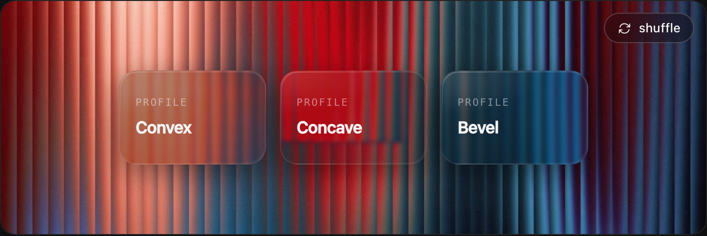
<GlassCard profile="convex" />   // magnify
<GlassCard profile="concave" />  // cave in
<GlassCard profile="bevel" /> // crisp edgeFor the button I went back to Petr Knoll's liquid-glass button
(the one B3's explorer uses) and stole the feel, not the markup. Three touches do
most of the work: a specular sheen that sweeps across on hover and drops on
press (the angle animated through @property so it glides), layered inset shadows
for thickness, and a press that tips the glass back in 3D and sinks the shadow
inward, like you actually pushed it. Hold one down and you can feel it.
These are the real buttons, tap one and it fires a real glass toast:
Refraction is Chromium-only, so a third of your users get frosted blur instead,
which is fine, it still looks like glass, just flatter. The displacement runs on
the GPU and is cheap, but it's another filter in the paint, so I don't put it on
hundreds of elements. And @property transitions (for the sheen) degrade to a
jump on older browsers. None of it breaks; it just gets simpler.
That's it: real edge refraction, springy motion, light and dark,
optional haptics, in toasts / buttons / panels / a raw <Glass> surface. It's MIT,
the displacement engine is shared across the kit, and you can drag the glass around
and tune the optics yourself in the Glass Lab.
npm i glaceui · glaceui.com · GitHub